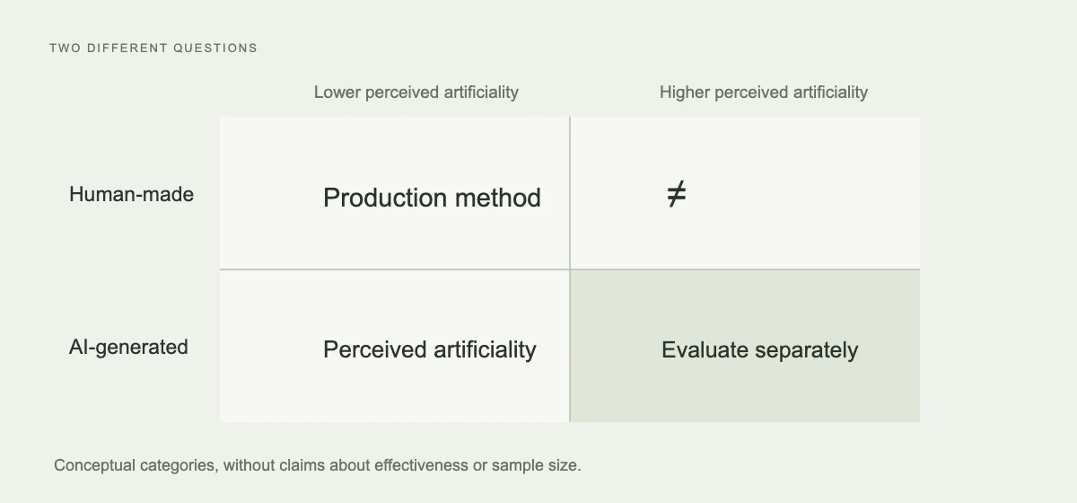
Discussion of AI images often stops at whether they look real. Brands face more specific tasks: can customers recognise the product, understand the image and want to learn more—and does the page after clicking meet expectations? Even a convincing image can fail at those tasks.
A 2025 MSI working paper AI in Disguise offers a useful starting point. It studies actual image-production methods separately from whether observers think an image looks like AI. Distinguishing those variables is more useful than giving AI material one overall score.
Production method and perceived artificiality are different
The study builds a quasi-experiment from actual display-ad data, comparing AI and human images from the same advertiser under the same campaign settings. The overall click-through difference is not significant; after accounting for perceived artificiality, generated images that do not look like AI perform better. The study covers one platform, model and period.
This does not supply a universally correct image checklist for brands. It suggests that production method alone does not explain audience response. How an image is understood needs separate observation.
In creative discussions, break the “AI look” into specific, editable problems: inaccurate product structure, unsupported materials, a composition without a subject or every detail competing equally for attention. Each needs a different response. Repeating “realistic” in a prompt does not replace judgement.
Product facts come before visual style
Take leather goods as a hypothetical example. Customers need to understand a bag’s shape, proportions, opening, handles and material. If an atmospheric scene changes those identifying features, its usefulness for buying decisions is questionable. Reviewers should return to actual product photographs rather than choose the prettiest generated option.
Visual style can be explored. Backgrounds, composition, light and narrative viewpoints offer new expressions, but define which parts can vary and which are product facts. That agreement can reduce wasted rework and tells reviewers what to inspect.
Considerable creative room remains. Images can be illustration, concept art or editorial photography; their role should be clear. Concept images explain an idea, product images represent an item, and case screenshots show an actual interface. They need neither impersonate each other nor substitute for each other’s evidence.
What still needs answering after a click?
The paper principally studies display-ad clicks. The authors note that data does not cover landing-page content, making downstream conversion difficult to attribute to image generation. Findings about clicks should not become a claim of sales growth for a brand.
For a content experiment, agree which stage is being observed. If the goal is qualified enquiries, define qualification and the promise made jointly by image, copy and landing page. Changing audiences, bidding or pages alongside creative makes the creative’s own effect difficult to interpret.
Associate asset versions with experiment records. The team should retrieve the exact file used, why it was selected, what changed and why it was later kept or discarded. Accumulating images alone does not necessarily accumulate brand knowledge.
The study encourages attention to specific creative choices and feedback. Production tools can change; product accuracy, clarity and support for the original hypothesis still need separate judgement. What remains should be experience the team can use next time.